
Lakeside Center
Minneapolis, MN | Tenant Improvement, Commercial


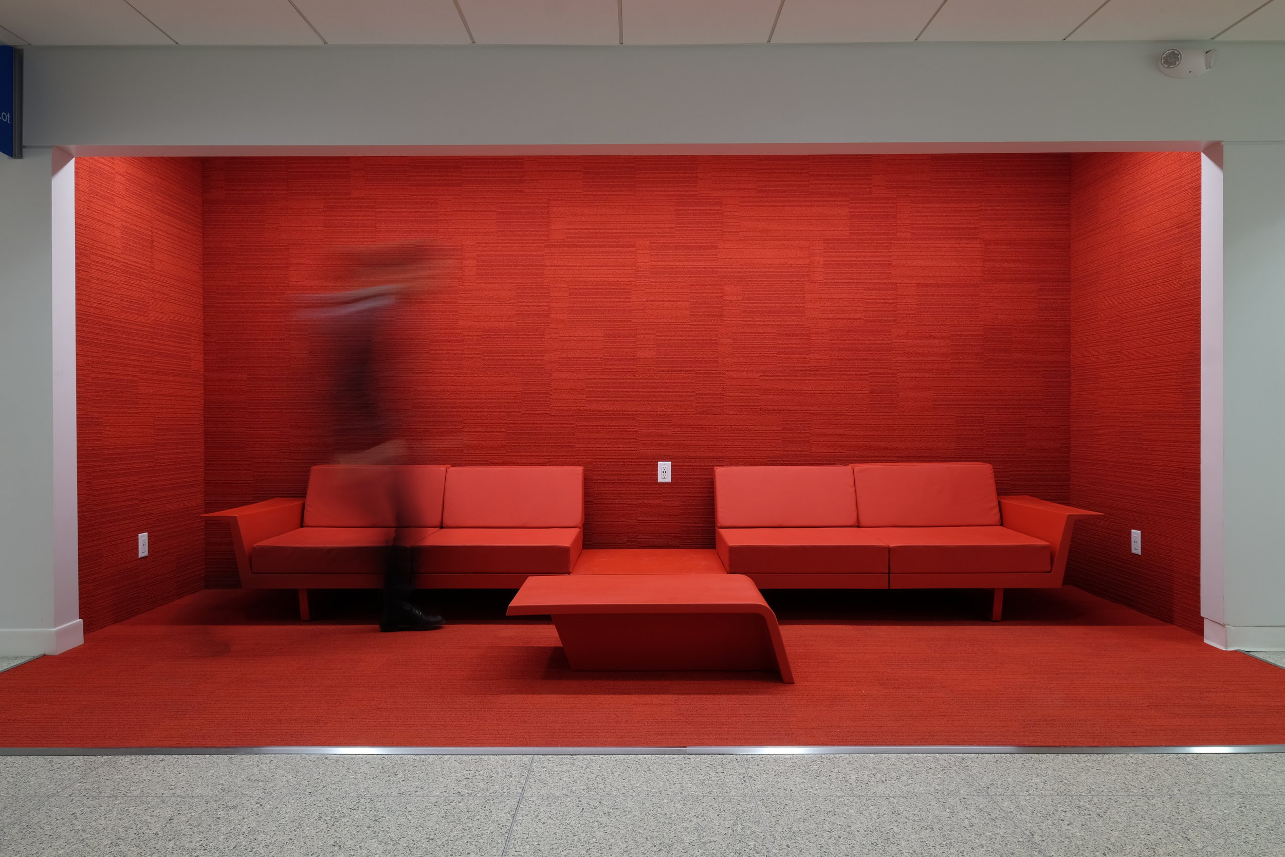
Fresh Appeal
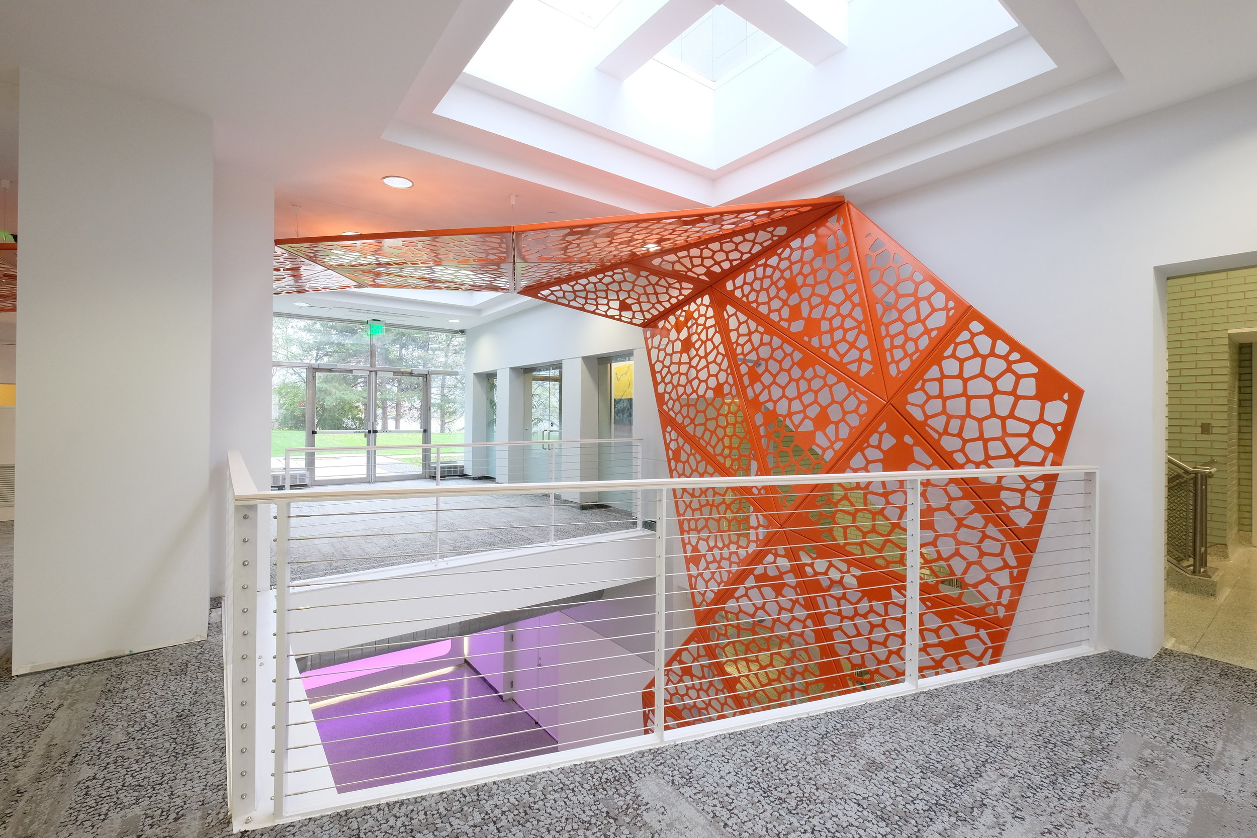
The two-story common areas of this 1950’s former insurance company headquarters needed an updated look and a clear concept to reestablish a contemporary identity and facilitate wayfinding. Goals for the project included appealing to a new generation of tenants and creating compelling “third” spaces to emulate a co-working environment. Playing off and teasing the rigid rectilinear geometry of the existing building, the flowing, angular orange ribbon — a parametrically modeled, sculptural series of unique, aluminum panels — is intended to bridge concept and reality, weaving through the common areas of the building like the touch of a magic wand to create a rich variety of programmatic elements that are needed along its path.


math is Cool
These catalytic moments along the path of the ribbon serve variously as wayfinding, lighting, railings, and seating areas, as well as a compelling piece of public art. The result is an alluring, provocative space that feels entirely renewed and effectively integrates the two floors and the main entries at opposite ends of the building. The custom, water jet cut, Voronoi ribbon pattern was developed using a form generating software algorithm. Each of the 60 plus aluminum panels are unique and final fabrication of the panels was developed from shop drawings created by RoehrSchmitt Architecture.

Read our feature story on The Lakeside Center Ribbon to learn more about the design team and our process for this very unique project.
Looking for a signature solution?
PROJECT PHOTOS BY ROEHRSCHMITT ARCHITECTURE